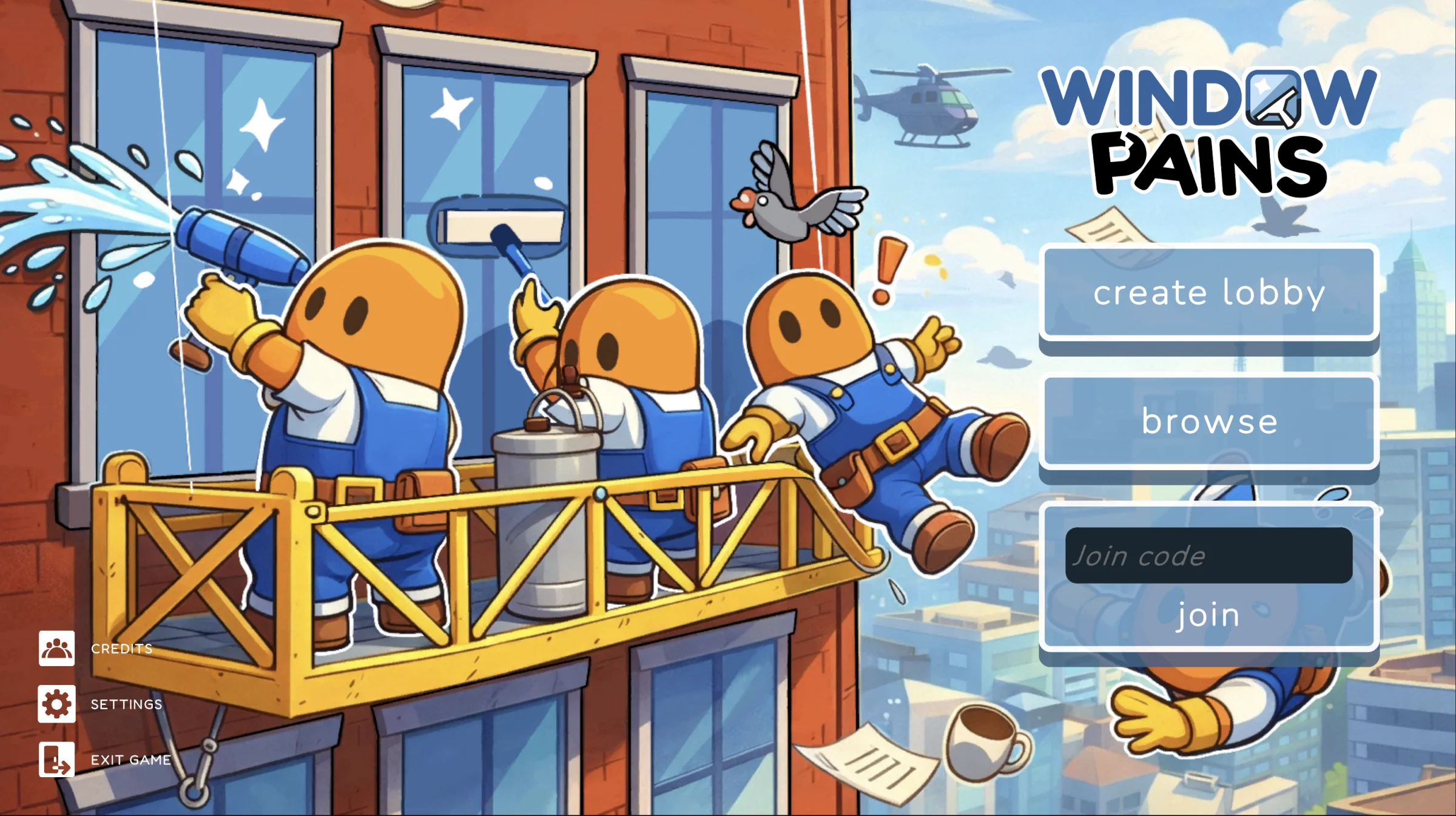
Window Pains started as a four-month capstone project built by a five-person team. We wanted to make a cooperative party game where players clean the side of a skyscraper while sharing the same suspended rig.
I owned the player-facing UI/UX, from getting players into a session to communicating readiness, progress, failure, and everything in between. I also implemented much of the interface directly in Unity and took on production responsibilities as the project evolved.
What initially sounded like a simple loop became much more complicated once every action had to work for multiple people at the same time.
We wanted players to need each other.
The goal was not to give four people the same independent task. Cooperation had to live in the mechanics and the physical space they shared.
We aligned around an experience that was cooperative first and competitive second, with light chaos, a friendly tone, and room for playful social moments.
The suspended rig was intentionally constrained. Players had to move around one another and coordinate around the same tools and control stations.
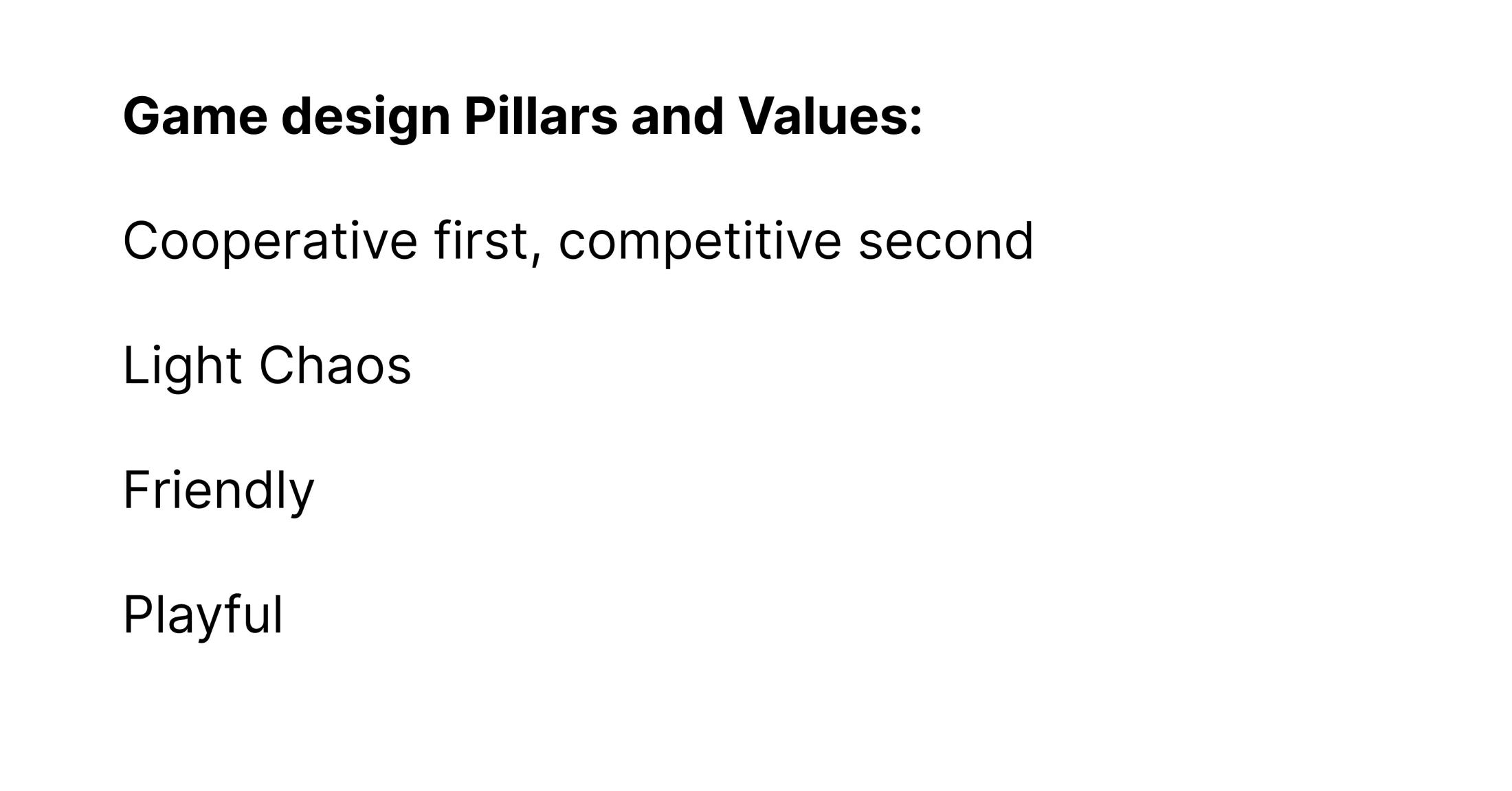
We aligned around cooperation, light chaos, and playful social interaction.
The lobby couldn't just be a waiting screen.
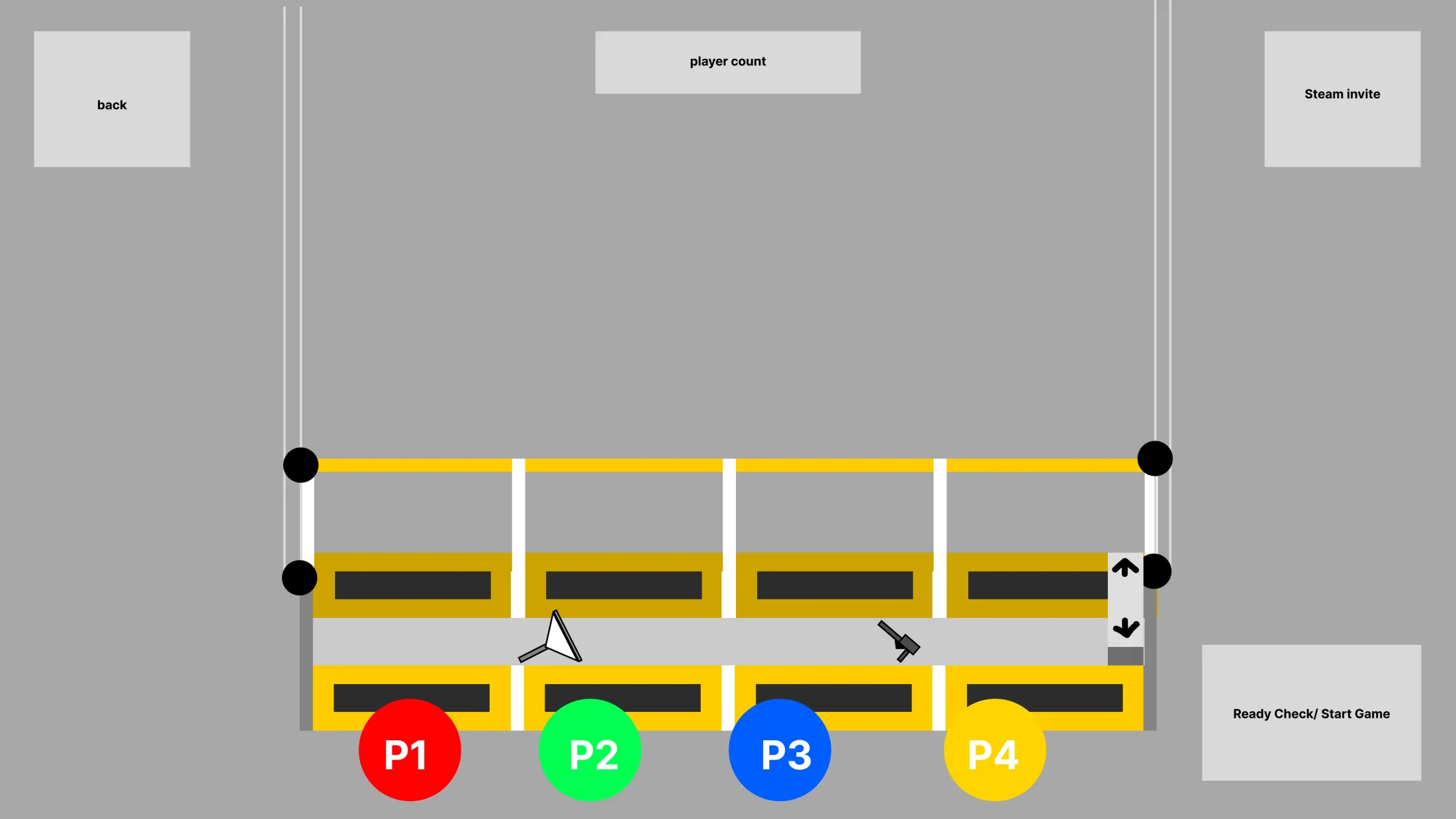
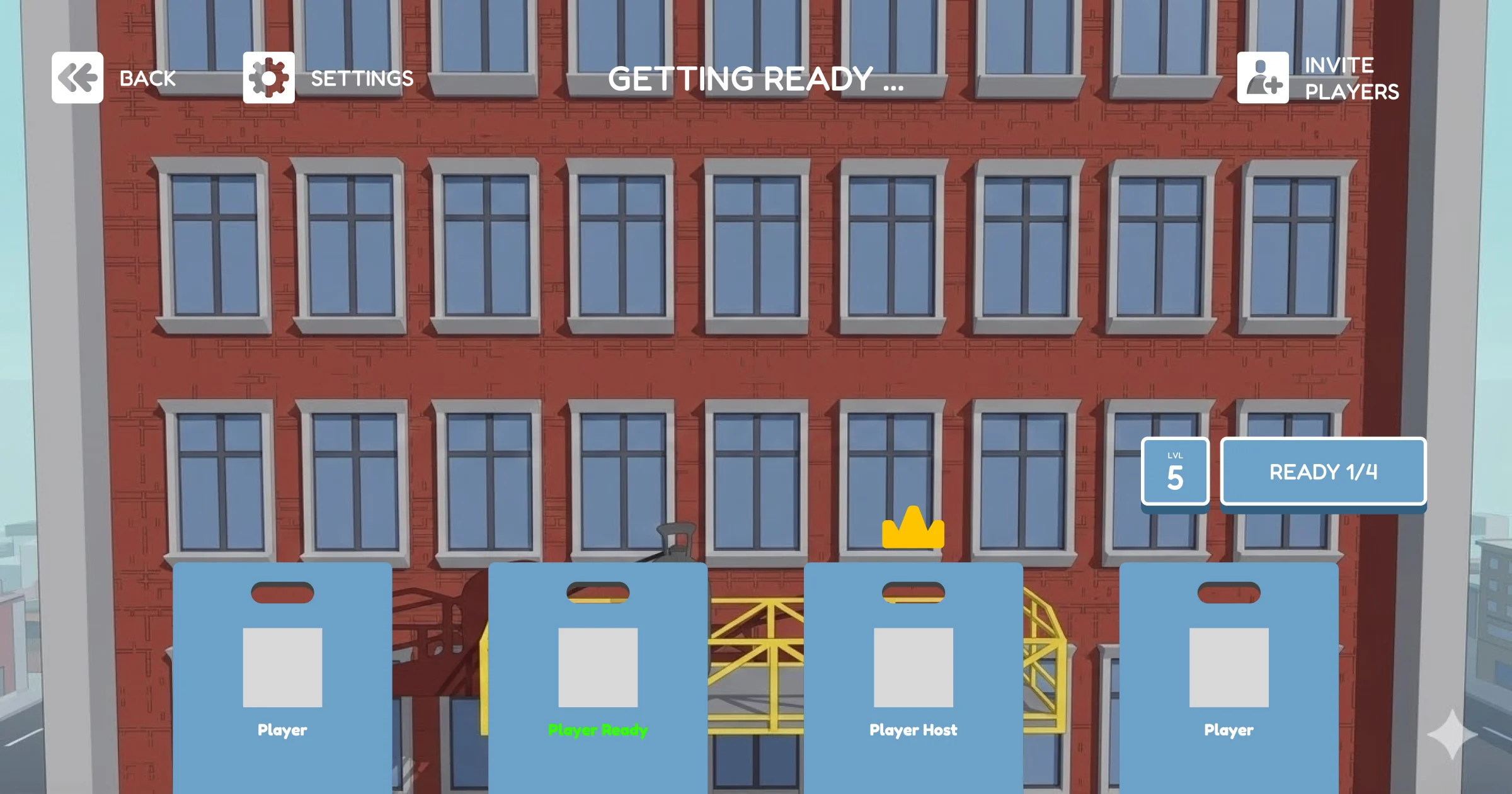
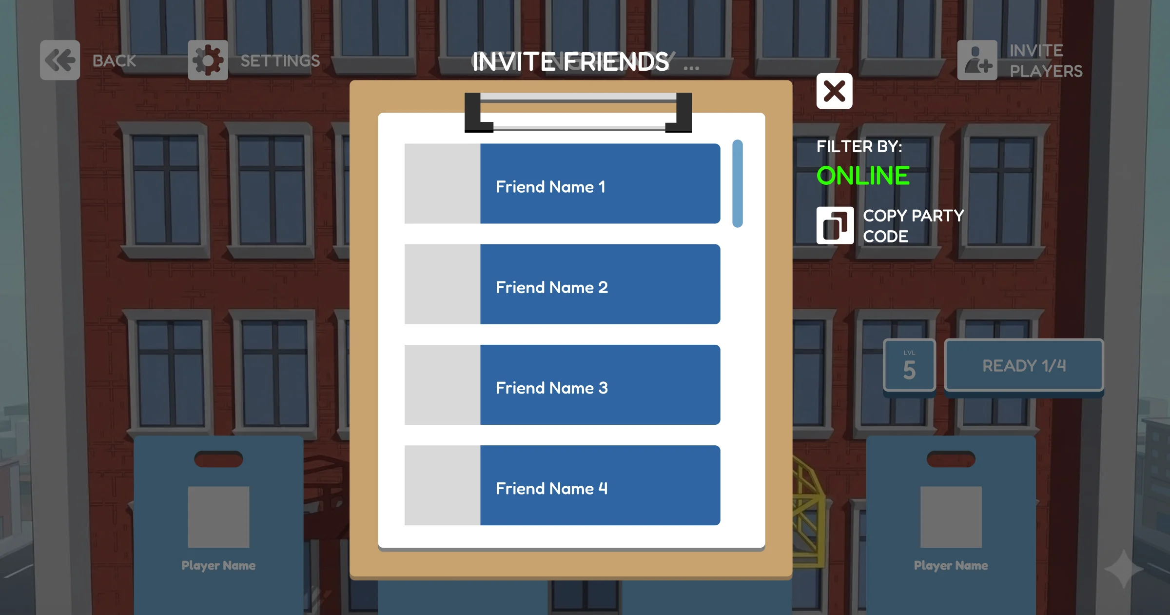
Multiplayer dramatically expanded what would otherwise have been a simple menu. Host and participant roles, player count, ready states, invitations, party codes, occupied slots, level state, customization, and people joining or leaving all had to remain understandable.
One screen had to represent the state and available actions of several people at the same time.
The waiting room was designed as more than a menu. Behind the multiplayer interface, players would share an actual 3D space where they could move around, interact with each other, customize their characters, and get familiar with the rig before the level began.
The player states, invitations, readiness controls, and party information shown here were always part of that experience. They were designed to sit on top of the playable scene rather than replace it.
We completed much of the interface layer, but ran out of time before the interactive environment underneath it could be fully built.
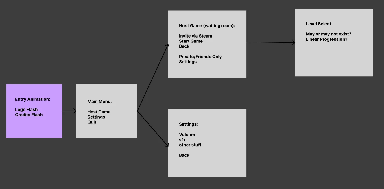
Hosting, inviting, readiness, settings, and level selection created a much larger state space than a single-player menu.
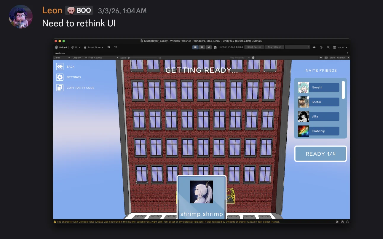
Then the UI and the game stopped looking related.
The interface started with a friendly, rounded, playful visual direction.
At the same time, the 3D environment moved toward a much heavier comic-book shader. When the systems came together, they did not feel like the same game.
The mismatch turned into an art-direction question: should the UI become more aggressive, or should the world move toward a softer toon style?
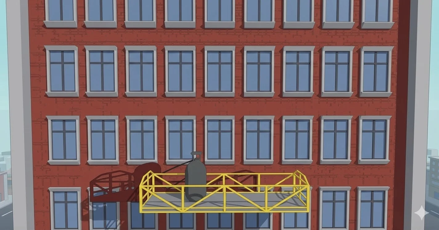
To make the second direction concrete, I used Gemini to quickly visualize what a softer waiting-room environment could look like. The image was meant as a communication prototype and placeholder for the 3D scene we hoped to build behind the interface.
We ran out of time before that playable environment could be implemented, so the visualization ultimately remained as the background in the submitted build.
Failure was supposed to happen a lot.
Our original flow treated winning and losing similarly. Both ended the level with a dedicated results screen.
But Window Pains was built around repeated mistakes. Players could fall from the rig or cause the group to fail within seconds of restarting. Stopping everyone at a Lose screen every time made failure feel heavier than it needed to.
Inspired in part by PICO PARK, we simplified the loop. Losing immediately restarted the level and increased the group's death count, while winning still received a proper conclusion.
Failure stopped being an ending and became part of the rhythm of playing together.
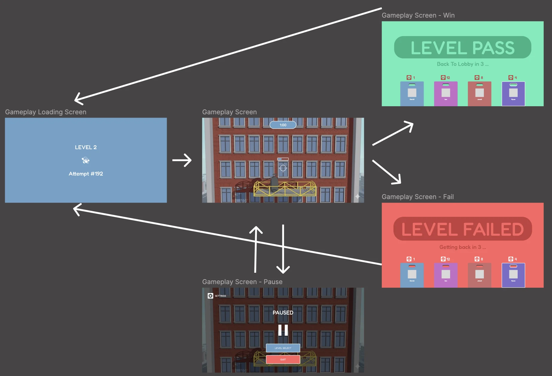
Early design with separate Win and Lose end screens.
Designing the screens wasn't the finish line.
I did not stop at Figma. I implemented substantial parts of the player-facing interface directly inside Unity, including menu UI, the lobby, ready states, invitations, loading, the gameplay HUD, pause, and win and fail states.
Working in-engine meant the screens had to respond to the real game, not only look complete in a design file.
When an interface state depended on networking or multiplayer logic, I worked with the programmers rather than independently engineering the multiplayer stack.
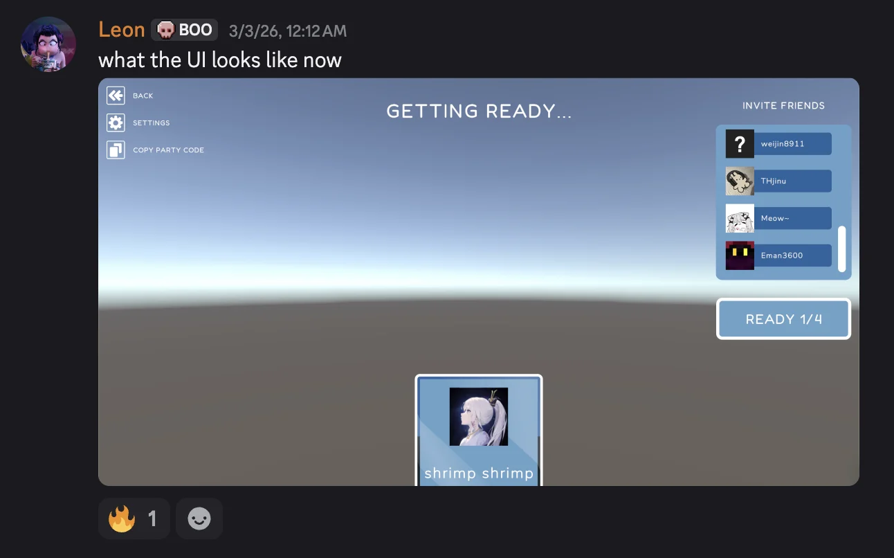
I implemented the player-facing UI in-engine and worked with the programmers when interface states depended on multiplayer logic.
The mechanics worked. The balance didn't.
By submission, we had reached an MVP of the intended multiplayer loop. Players could control the rig, spray and clean windows, fail, restart, and play together.
The problem was tuning. The controls and interactions were difficult enough that most first-time players struggled to get through the actual cleaning experience, even though the underlying mechanics worked.
For Demo Day, we added a simple obstacle course that was never part of the original game design. It gave visitors something they could immediately move through and experiment with, so they could experience the rig controls and multiplayer movement without needing to master the under-balanced cleaning loop.
The takeaway wasn't that we needed more things for players to do. We needed more time to make the mechanics we already had approachable.
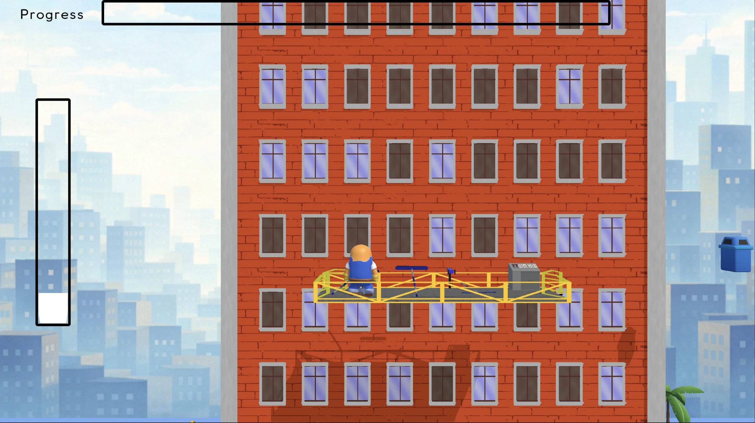
A temporary obstacle course let visitors experiment with movement and the shared rig while the intended cleaning loop still needed balancing.
Window Pains was the project where I stopped thinking about UI as a collection of screens. In a multiplayer game, every interface had to respond to several people, several states, and a game that was still changing underneath it.
If we had another semester, I would not spend it adding more menus or mechanics. I would spend it tuning the cooperation we finally had working.
Getting multiplayer to work was infrastructure. Designing why people wanted to play together was the experience.