
JSD Space had grown a lot since we first launched the website.
The store had more products, more customers, and more ways to shop. The website didn't really keep up.
Over time, we kept adding things whenever we needed them. A new menu here. Another vehicle selector there. A fitment tool in the hero. More links in the header.
Eventually, the site worked, but it didn't feel simple anymore.
And for an automotive store, there was one problem that mattered more than everything else:
Customers needed to know what actually fit their car.
The website kept asking the same question.
What do you drive?
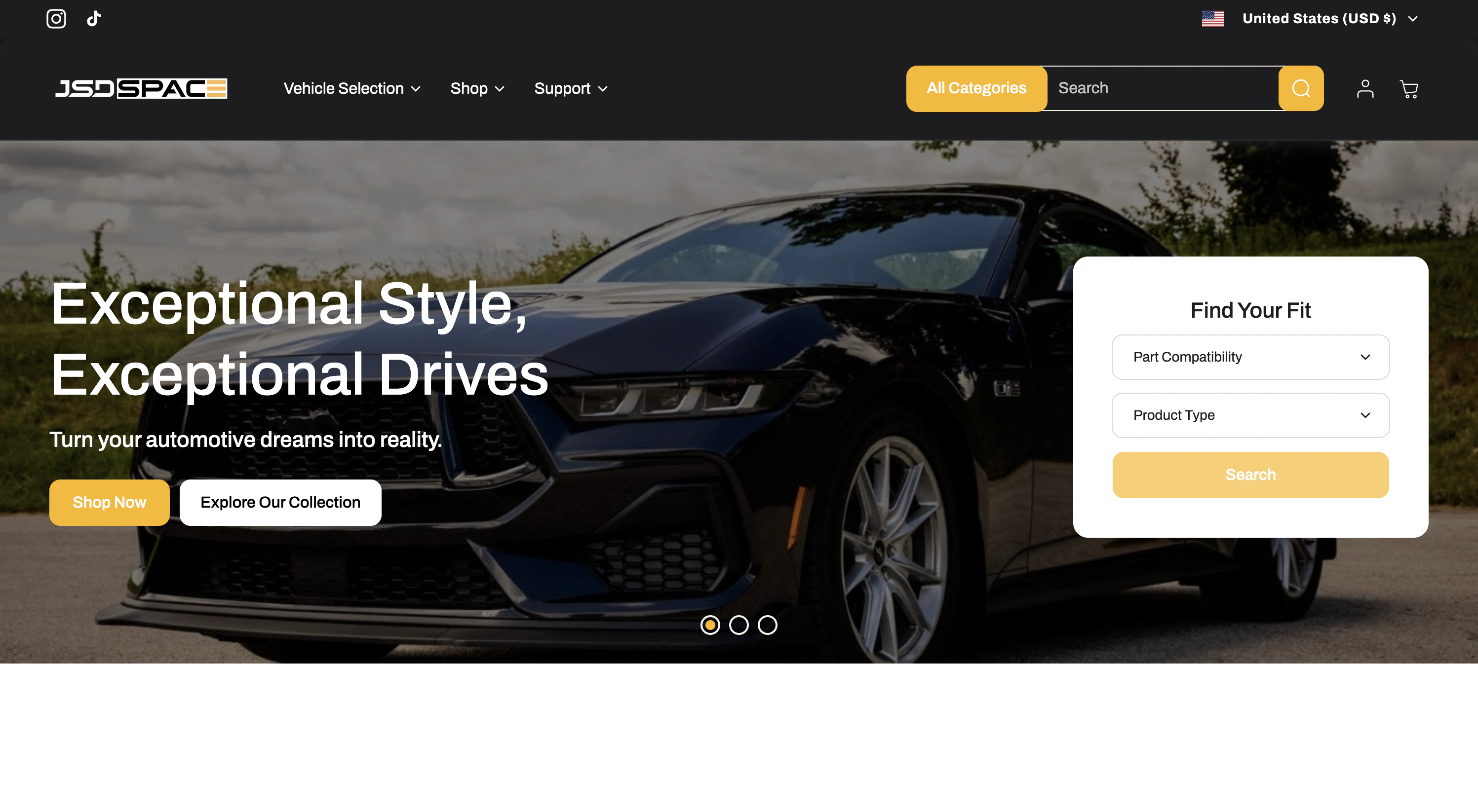
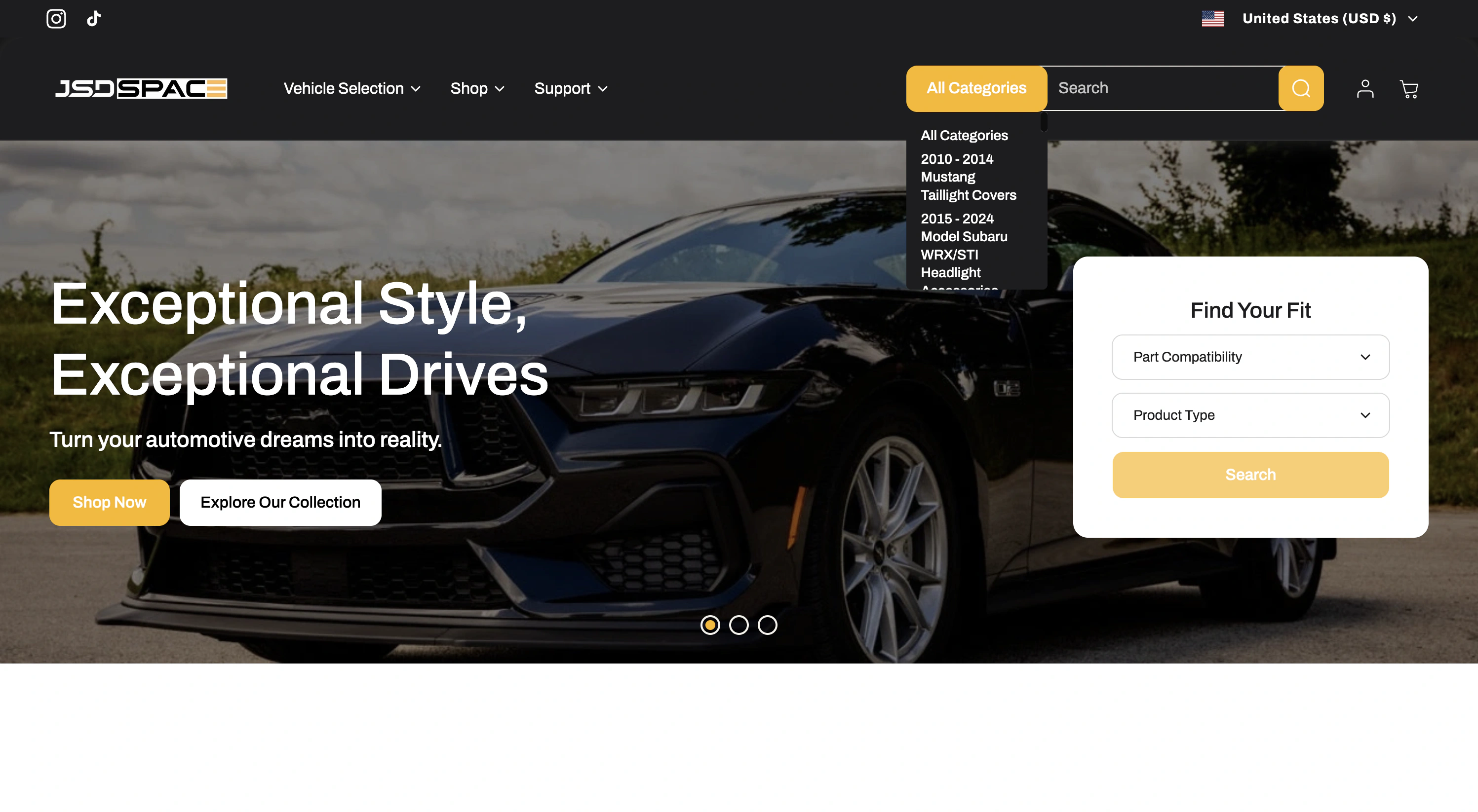
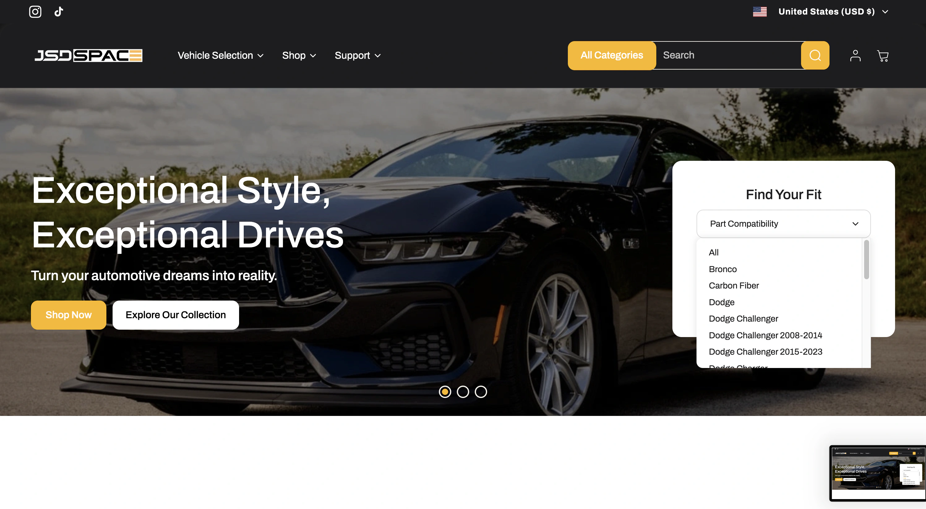
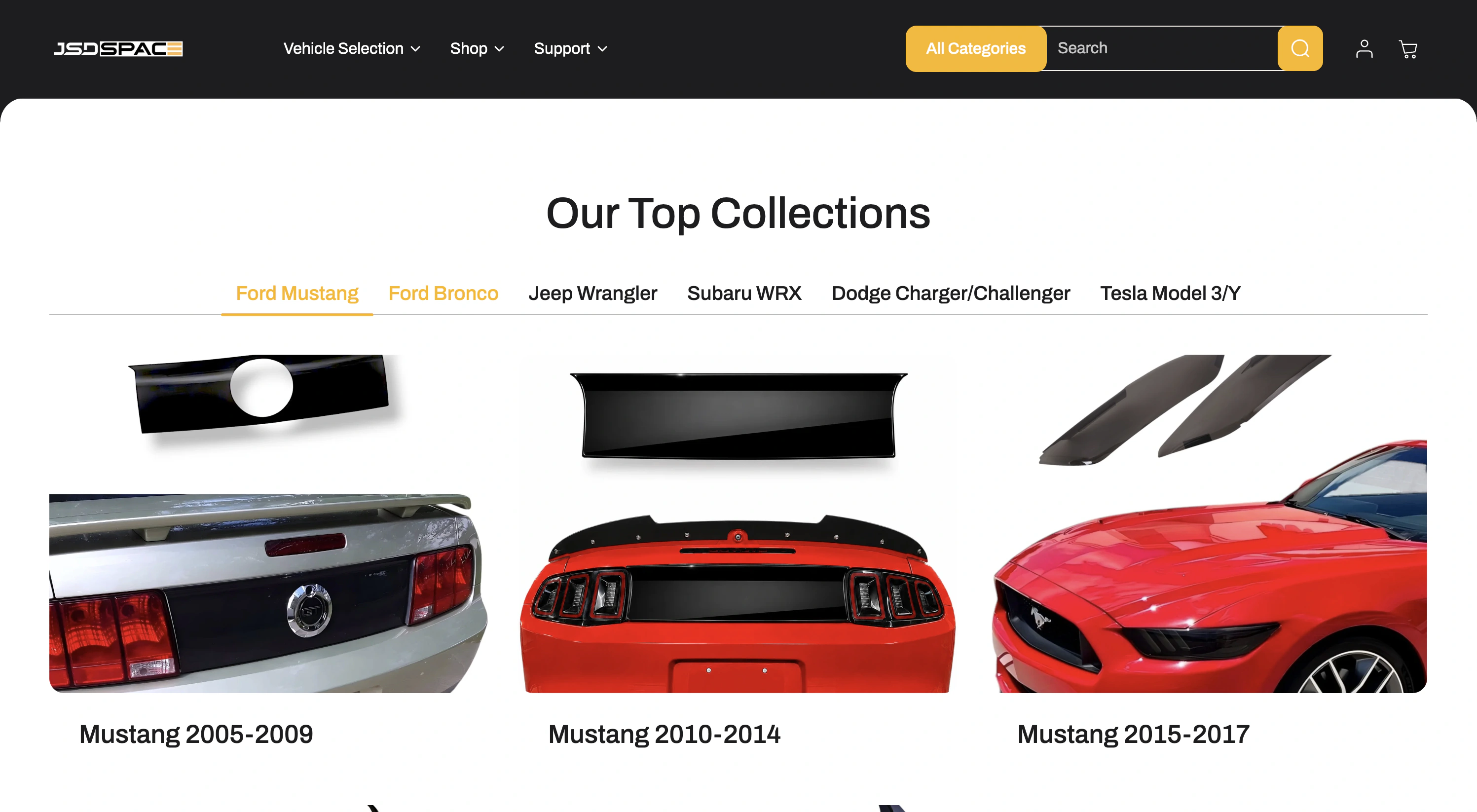
The old site asked this in a lot of different ways. Vehicle selection existed in the navigation, search, the homepage, and other parts of the store.
Each one made sense when it was added. Together, they didn't.
A customer could start in one place, find another selector later, or just shop without selecting a vehicle at all.
Many of the products only fit specific vehicles, so knowing what the customer drives isn't just useful. It can determine what they can actually buy.
So I stopped treating the vehicle like a filter.
The biggest decision in the redesign was pretty simple:
Once you tell us what you drive, the store should remember it.
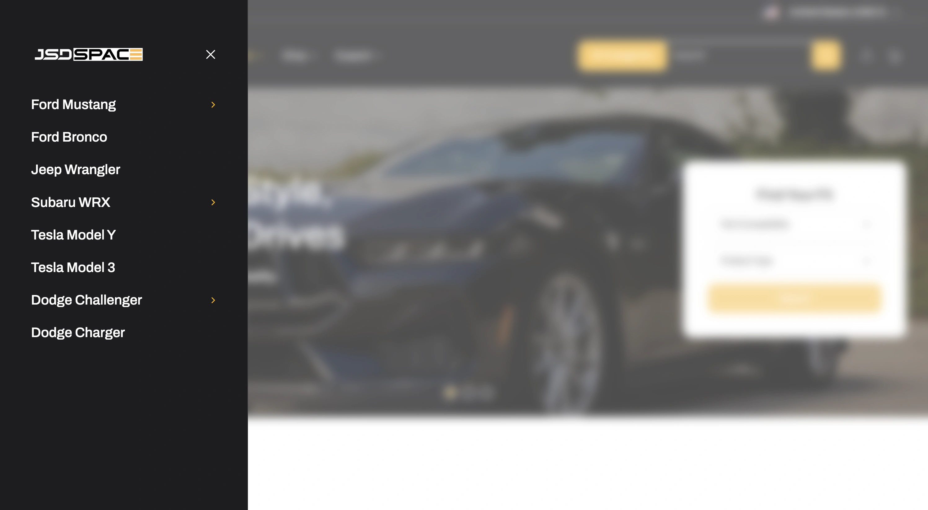
I replaced the different vehicle-selection systems with one flow:
Year→Make→Model
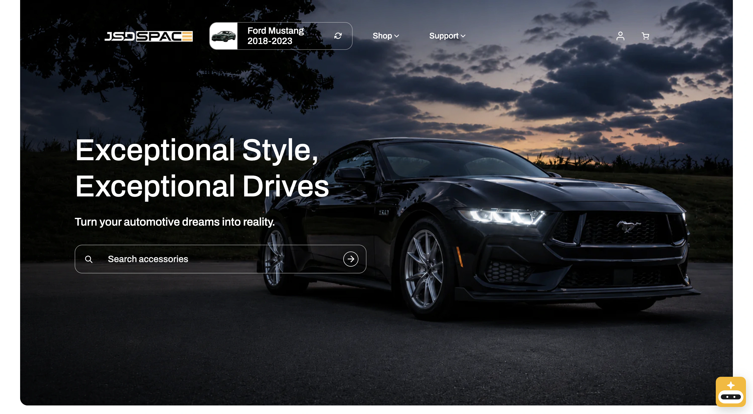
Once a vehicle is selected, it stays in the header. Now the customer can move around the store and always know what vehicle they're shopping for.
The site could now use that vehicle to show more relevant products too.
I also used AI throughout the design process to challenge flows and think through edge cases before I built them. It was especially useful when testing how the experience would hold up across different vehicles, content lengths, and screen sizes.
Mobile made this harder.
On desktop, there was enough room for the selected vehicle and search to live next to each other. On mobile, there wasn't.
Trying to squeeze both into the header just brought the clutter back, so I made the header change depending on what the customer is doing.
Normally, the selected vehicle stays visible. Tap search, and search takes over the space. Close it, and the vehicle comes back.
Shopping could start with the car too.
The old store mostly organized products around categories. But that's not always how customers think.
A lot of people don't come in thinking:
“I need an exterior accessory.”
They think:
“I have a Mustang. What can I get for it?”
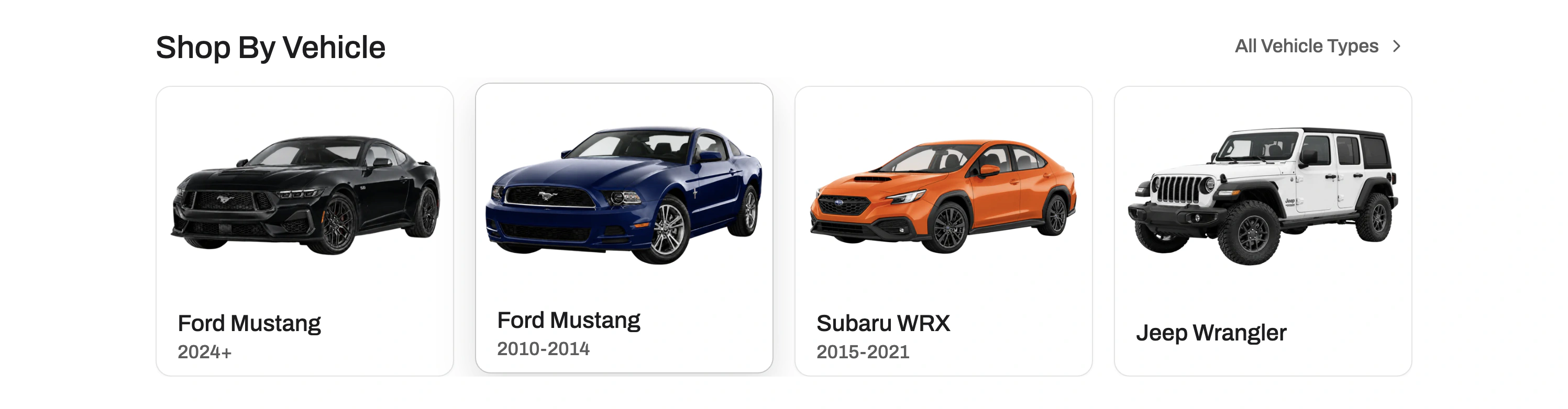
That led to two ways of browsing the new homepage: by vehicle, or by category.
The vehicle cards also needed a consistent image set across different makes, models, and generations. I used image generation to create and refine those assets instead of relying on a mismatched collection of source images.
Shop by Vehicle
Shop by Categories
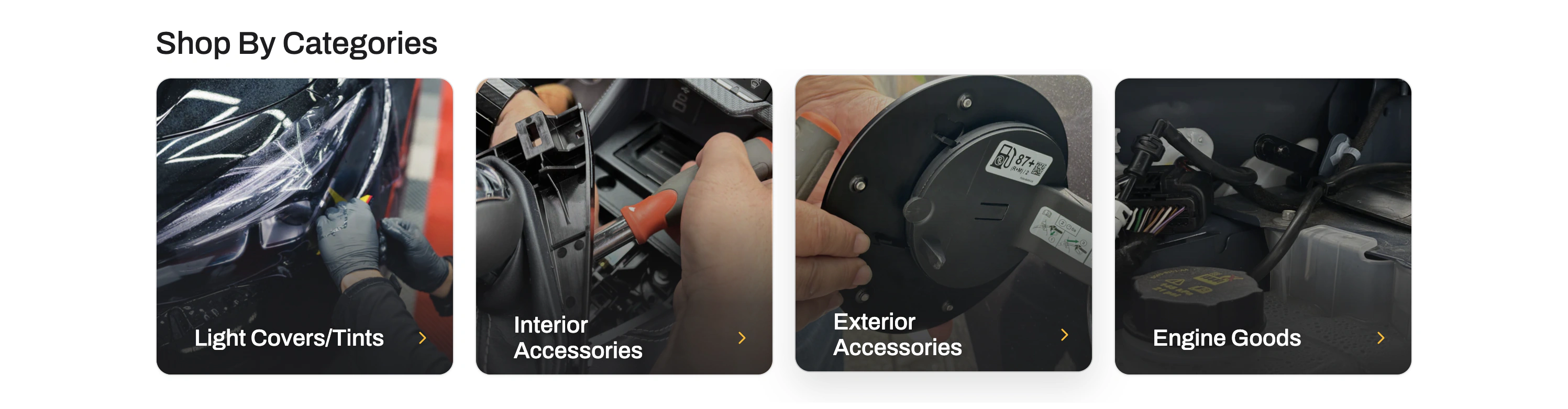
If you already know what you want, categories are still there.
If you just know what you drive, you can start there instead.
I also removed a lot.
The redesign wasn't only about adding a better vehicle selector.
Once the site remembered the customer's vehicle, a lot of the other elements didn't need to fight for attention anymore.
The header got quieter. The extra fitment tools went away. Search, products, and the customer's vehicle became the things that mattered most.
Then I had to make it real.
I designed the new experience in Figma, but the project didn't stop there. I also worked through the implementation inside Shopify.
When I moved into Shopify, AI became part of the implementation loop too. I used Claude Code and Codex to work through implementation, debug responsive issues, and make changes against the real storefront.
That meant dealing with things a perfect Figma frame doesn't really show: real product names, real images, different screen sizes, and long vehicle names.
Sometimes something looked finished in Figma and immediately felt wrong once it was running on the actual site.
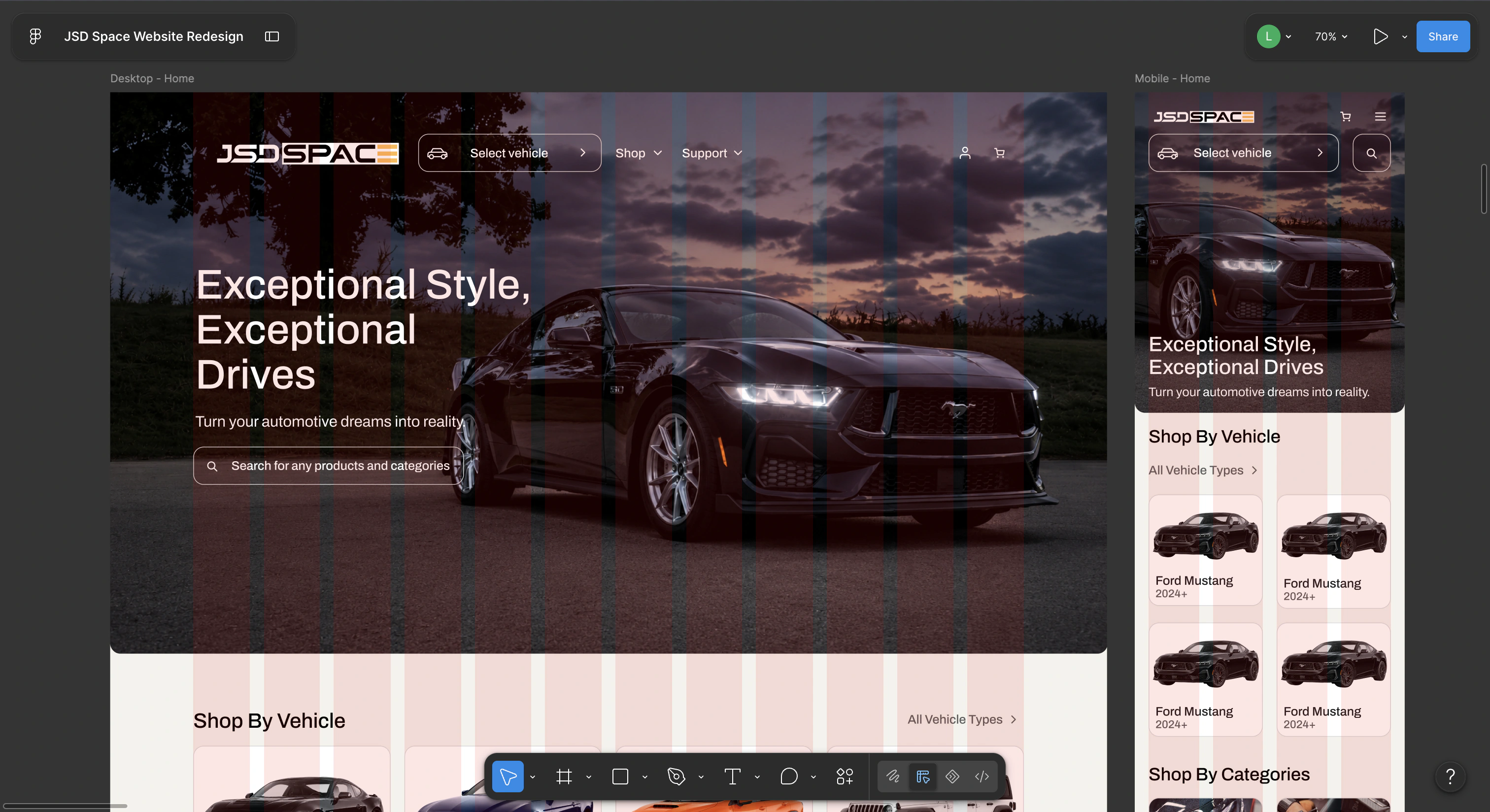
Designed in Figma
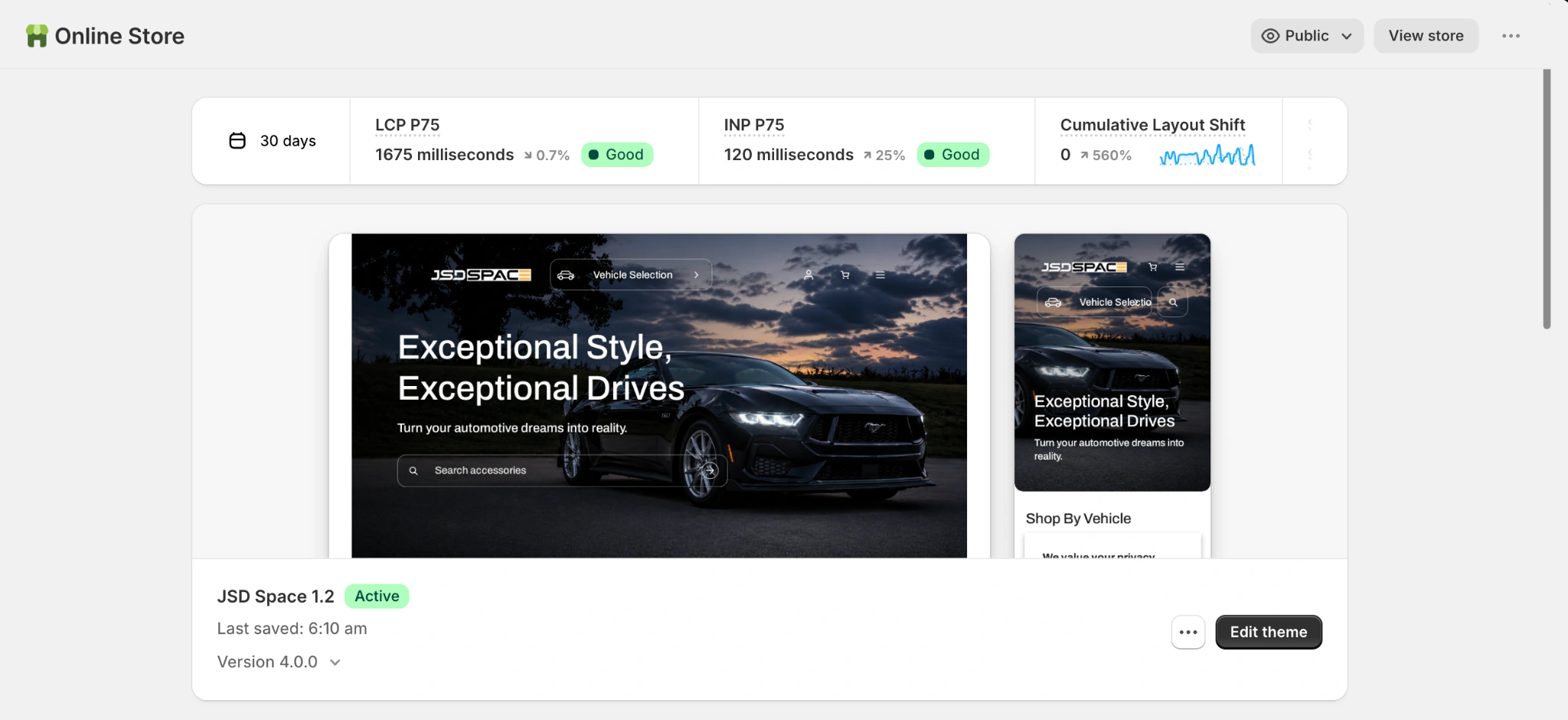
Implemented in Shopify
So I kept moving between Figma and Shopify, fixing problems as they showed up.
Building it made me catch problems I never would have noticed in Figma alone. AI made that loop much faster.
AI also helped me make the visuals.
Most of the redesign work was about structure, flow, and implementation.
But I also needed supporting visuals for the new storefront.
For the AI Assistant promotion, I already had the flat icon in Figma and a pretty specific image in mind: turn it into something dimensional and surround it with products from the store.
I used image generation as a production tool, not as a replacement for the design itself.
The early outputs looked polished, but they drifted too far from the identity I had designed. So I kept redirecting the composition until the result felt like an extension of the brand instead of a different character entirely.
This was the part I liked most about using AI here. It let me move faster when the idea was already clear, but the final judgment still had to come from me.
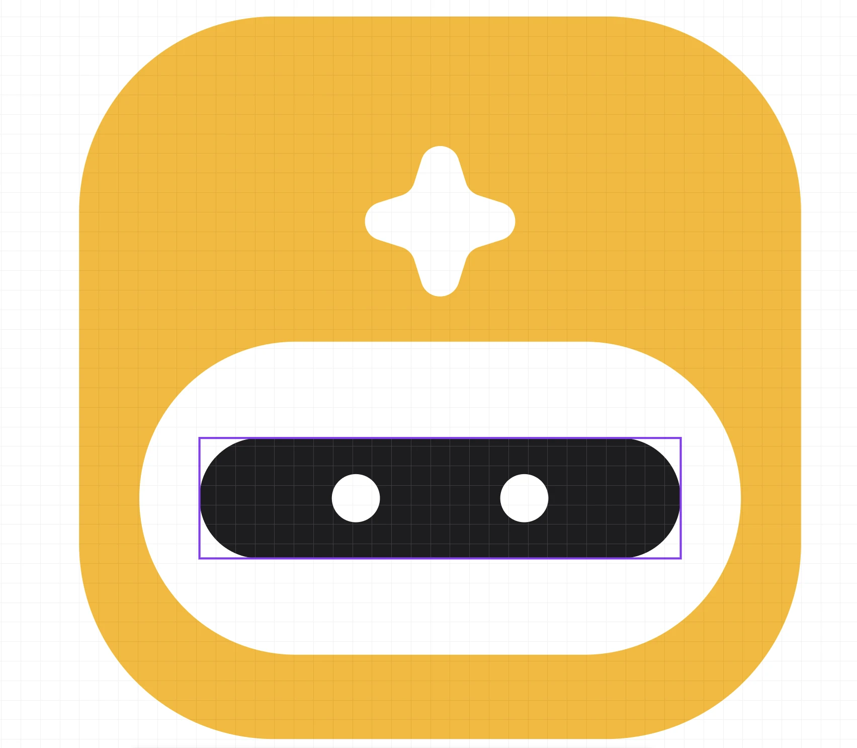
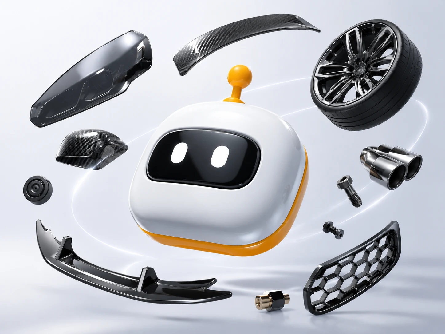
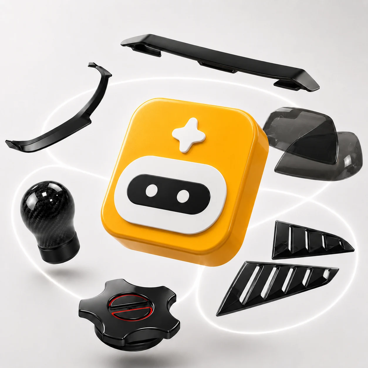
I used AI to explore and produce supporting storefront visuals, but kept steering the result back toward the identity I had already designed.
Then something interesting happened.
After launch, Shopify reported a bot-filtered conversion rate of 1.75% during August 16–October 15, 2026, approximately 430% higher than 0.33% during May 2–June 30, 2026.
Custom May–June baseline, with identified bots excluded from both periods. Data captured October 15, 2026, at approximately 1:13 a.m. EDT; the final day was only partially measured. The current window crosses Shopify's September session-measurement update, so this comparison does not isolate the redesign's contribution.
Looking back.
The biggest improvement wasn't one screen or one component.
It was making the customer's vehicle part of the store itself.
Before, customers could move through the site without the store really knowing what they drove.
After the redesign, the site could remember their vehicle as they shopped.
That made a lot of the smaller decisions easier. The header got simpler. Vehicle selection stopped repeating itself. Product discovery made more sense.
And the website started feeling less like a catalog customers had to figure out, and more like a store that already understood what they were shopping for.