Designing meaning into tracked data
Pokémon Tracker began as a class assignment to design a smartphone tracking interface where color, form, and composition communicate progress and significance at a glance. I interpreted the prompt as a competitive collection system. Instead of only showing players what they had caught, the interface would show how their collection compared with others.
Use visual form, composition, and color to make tracked progress understandable and emotionally meaningful.
Turn collection data into relative performance through percentiles, rarity, and global rankings.
Collection totals, Pokédex completion, shiny counts, CP, levels, and appraisal establish the player's current state.
Percentile rankings and rarity indicators transform raw values into context.
Leaderboards and global distributions give collectors visible targets to work toward.
Knowing the number wasn't enough
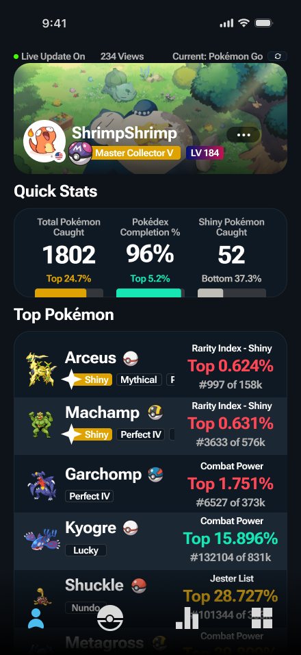
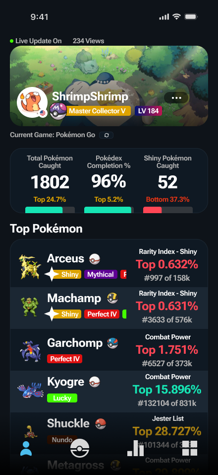
The home screen pairs absolute collection totals with relative rankings. Instead of only telling a collector that they caught 1,802 Pokémon or completed 96% of the Pokédex, the interface also shows where those numbers place them compared with other collectors.
That relationship between progress and position became the foundation of the concept.
Giving individual catches competitive context
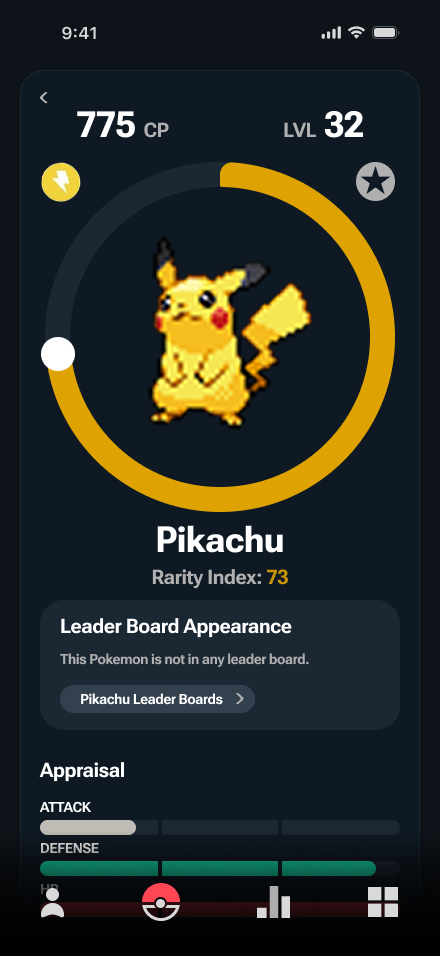
The details view shifts from collection-level progress to the competitive value of an individual Pokémon. CP, level, rarity, leaderboard status, and appraisal create a hierarchy from identity to performance.
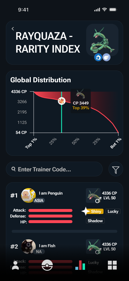
The leaderboard places those values within a broader distribution. Rather than presenting rank as an isolated number, the graph shows where the Pokémon falls relative to the larger player population.
Feedback exposed an inconsistent color system
In the earlier version, ranking labels, progress bars, and status tags competed with one another and did not always use the same color logic.
Feedback called out the mismatch between ranking text and its corresponding progress visualization. I revised the system so equivalent ranking states shared the same treatment and reduced the prominence of secondary status tags.
Testing the interface beyond normal color vision
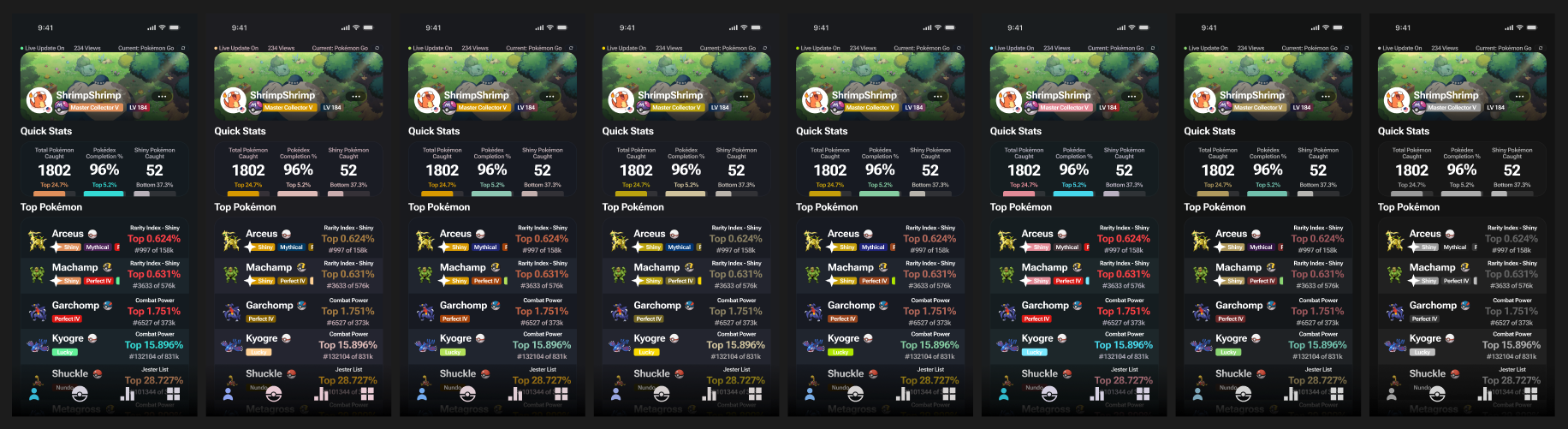
Because the interface relied heavily on color to communicate ranking and status, I reviewed the primary screen under multiple simulated color-vision conditions to check whether the information and hierarchy remained distinguishable.
Looking back, I would reinforce more states through form, icons, and labels so color carries less of the communication burden.
Expanding beyond the required tracking screen
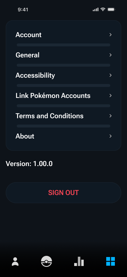
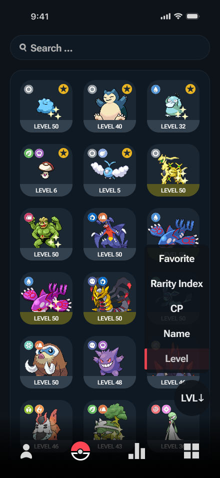
Although the assignment centered on one primary tracking interface, I extended the concept into a broader mobile system with collection browsing, filtering, Pokémon details, leaderboards, and account settings.
The Pokédex reused the same card, tag, type, and ranking language while supporting search and multiple sorting states.
What I would carry forward
Pairing absolute collection data with relative rankings was the strongest part of the concept. A number like “1,802 caught” becomes more meaningful when the interface can also communicate “Top 24.7%.”
The interface asks too many colors and status tags to compete for attention. Today I would reduce the number of semantic colors, establish a stricter token system, simplify secondary tags, and make ranking states distinguishable through more than color alone.
Unofficial student concept. Not affiliated with or endorsed by The Pokémon Company or Nintendo.