Empathize
Understanding where food delivery becomes frustrating
I interviewed four people about how they used food delivery apps, what frustrated them while ordering, and how they got food when they did not want to cook. Two were university friends and two were friends from elsewhere. Everyone was in their early 20s, so the research mainly reflects younger delivery-app customers.
Fake deals
Promotions could look attractive, then disappear or become unclear by checkout.
Delivery fees
Extra fees could make the final price much higher than expected.
Option overload
Too many choices on one screen and too many checkout steps made ordering harder.
Delivery time
Estimates were not always accurate, and changes were not always communicated clearly.
Turning recurring needs into a primary persona
Quang is a college student who wants affordable meals, quick ordering, reliable discounts, and clear food information. I used the persona to keep the project focused on the problems that came up in the interviews: confusing deals, unexpected costs, crowded screens, and unreliable delivery estimates.
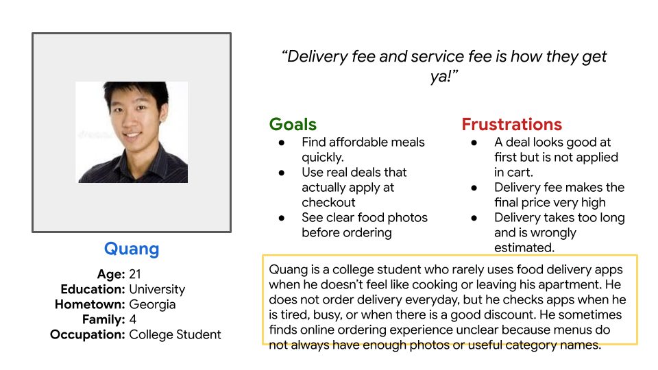
Primary persona: Quang, college student.
Define
Mapping the journey showed where trust breaks down
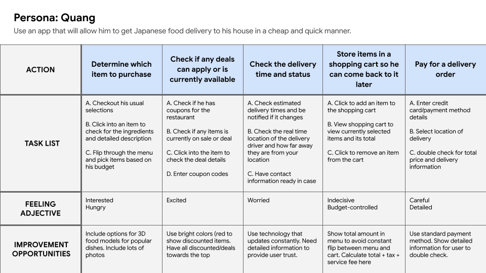
The journey follows ordering from choosing food through payment.
Make deals and food information easier to evaluate.
Keep cost visible instead of revealing it only at checkout.
Provide clear delivery progress.
The journey map helped me see that the problem was bigger than finding a meal. Friction appeared while checking deals, understanding the running price, moving through checkout, and tracking delivery.
How might I make ordering feel predictable from menu discovery through delivery?
Show offers early and confirm the discount at checkout.
Keep the running order total visible.
Make the current order status easy to read.
Ideate
Exploring the experience before committing to a layout
I sketched five versions of the Home screen before opening Figma. Trying the same deals, categories, search, menu, and cart content in different structures made it easier to see what worked and what became crowded.
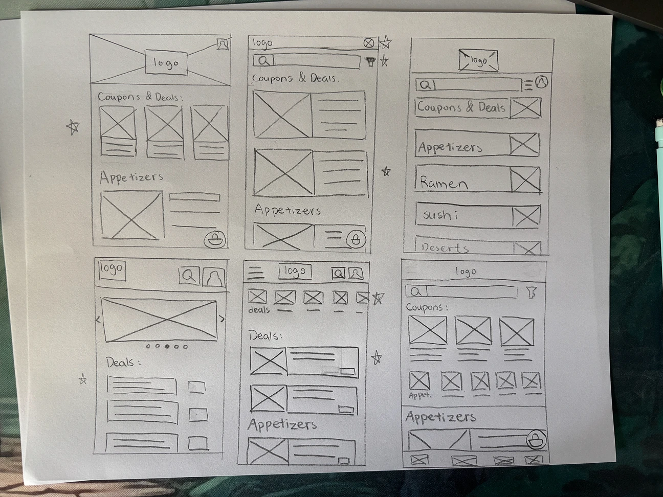
Five Home-screen variations used to compare browsing and navigation structures.
The direction that moved forward kept deals near the top, made search and categories easy to reach, supported scannable food browsing, and kept the cart visible.
Prototype
Turning a screen concept into an end-to-end ordering journey
I moved from the paper sketches into digital wireframes, connected the ordering flow in a low-fidelity prototype, and then developed the high-fidelity screens.
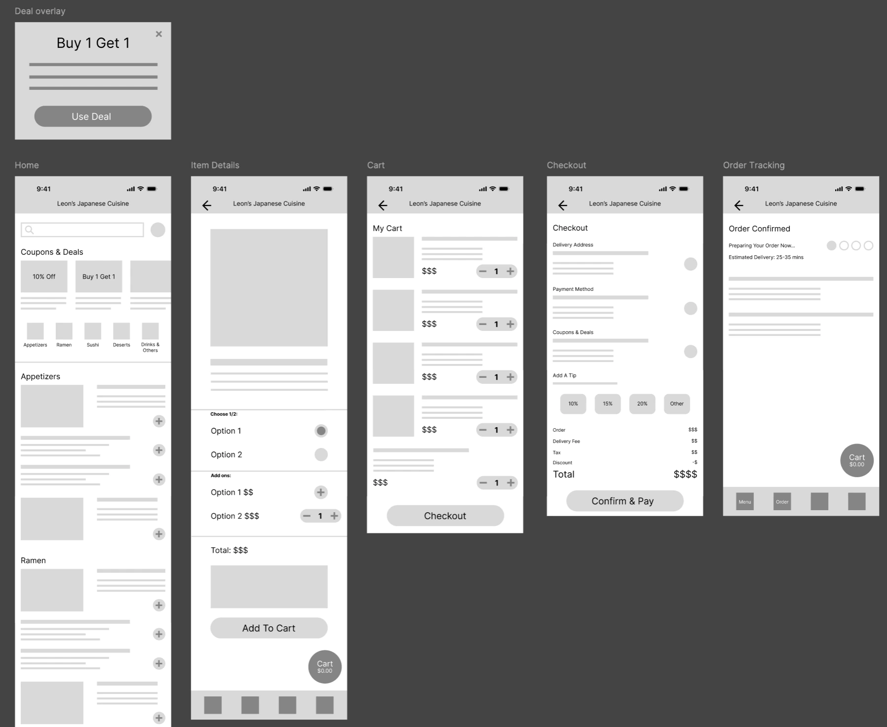
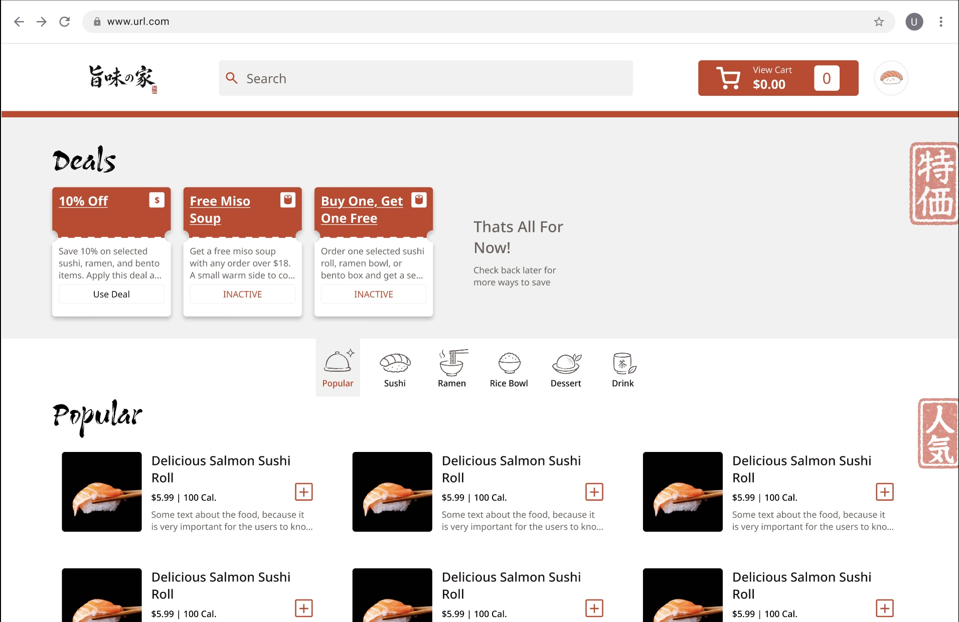
Promotions appear early on Home instead of disappearing into the ordering flow.
The cart shows the running order total while customers browse.
Cart review, address, payment, tip, fees, and confirmation come together in a shorter flow.
Checkout shows the applied deal and discounted amount, so customers can tell whether it worked.
Test
Evaluating the first high-fidelity prototype
I tested the first high-fidelity prototype with one participant and watched him work through the ordering flow. Even in one informal session, problems became obvious that I had stopped noticing while designing it.
Product details
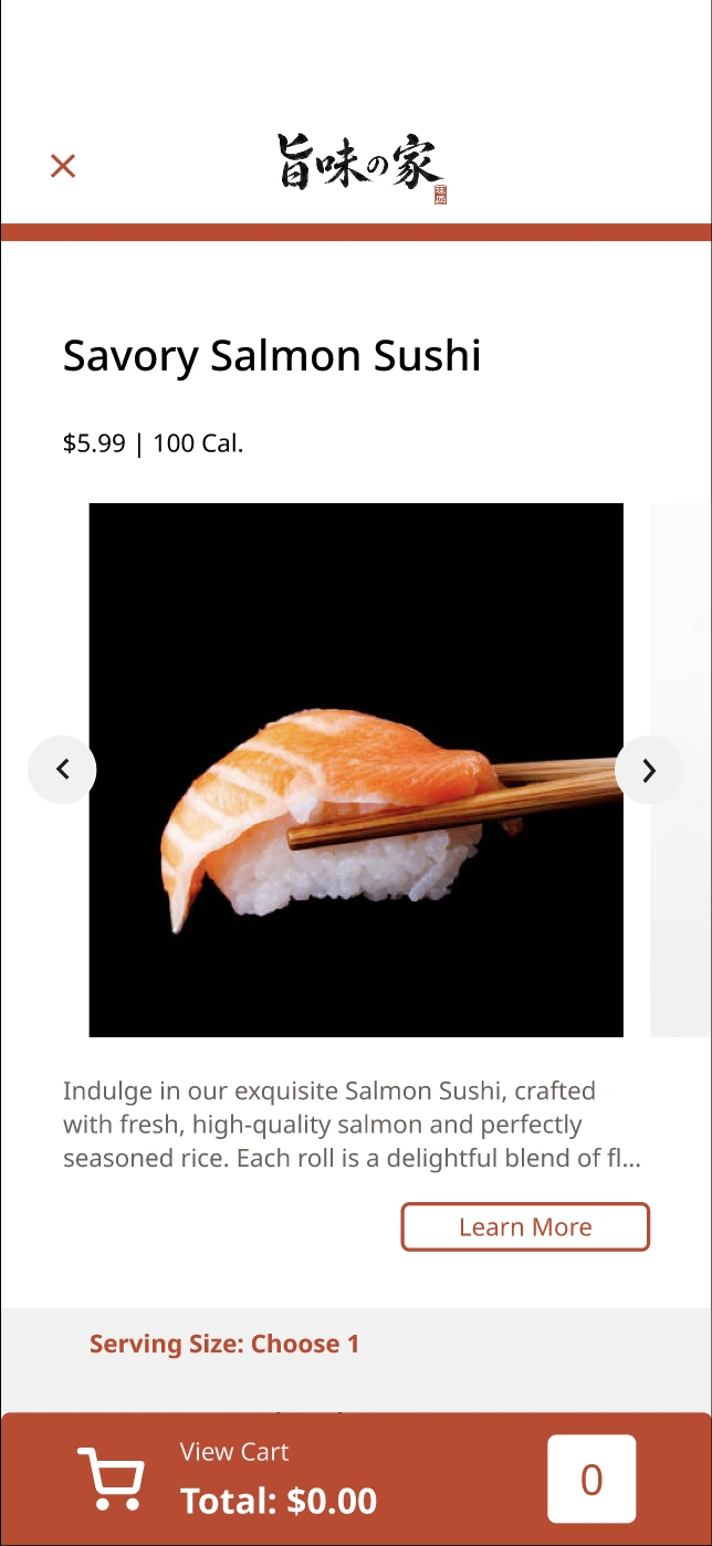
The header and title competed with the food, while the smaller image carousel was easy to miss.
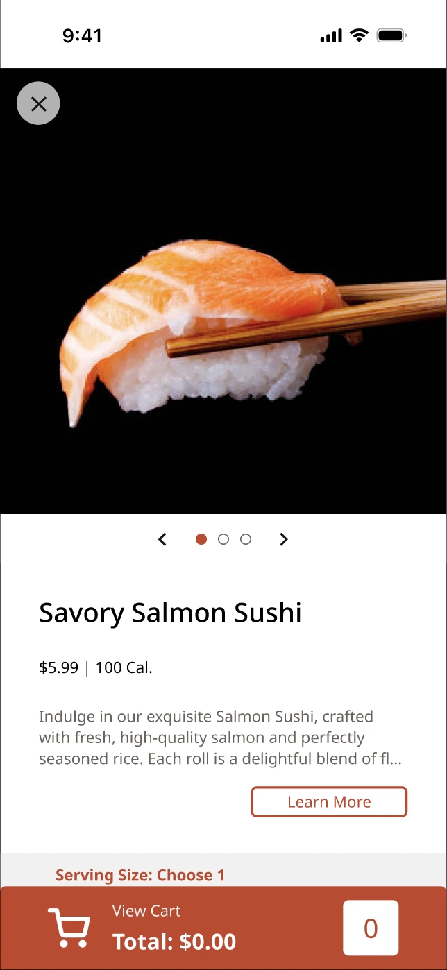
I moved the food image to the top, made it full width, and clarified that more images were available.
The revision placed product imagery first so the item itself became the focus.
Order tracking
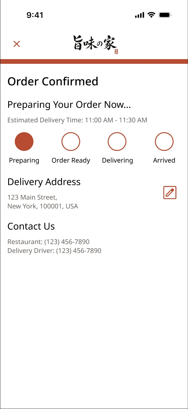
Four similar circles made Preparing, Order Ready, Delivering, and Arrived difficult to tell apart at a glance.
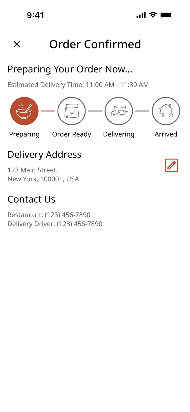
I added distinct illustrations, connector lines, and a stronger active state for each delivery stage.
The revised tracking system made progress faster to understand and directly addressed the earlier delivery-status concern.
This was one informal session, and I did not test the redesigned version again. I treat these changes as the next iteration, not a validated final solution.
The session gave me a clear list of changes to make next.
Giving the interface its own visual character
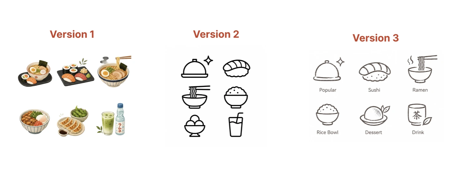
The visual language evolved toward a hand-drawn icon system that better complemented the restaurant's calligraphy and stamp-inspired identity.
Extending the experience beyond mobile
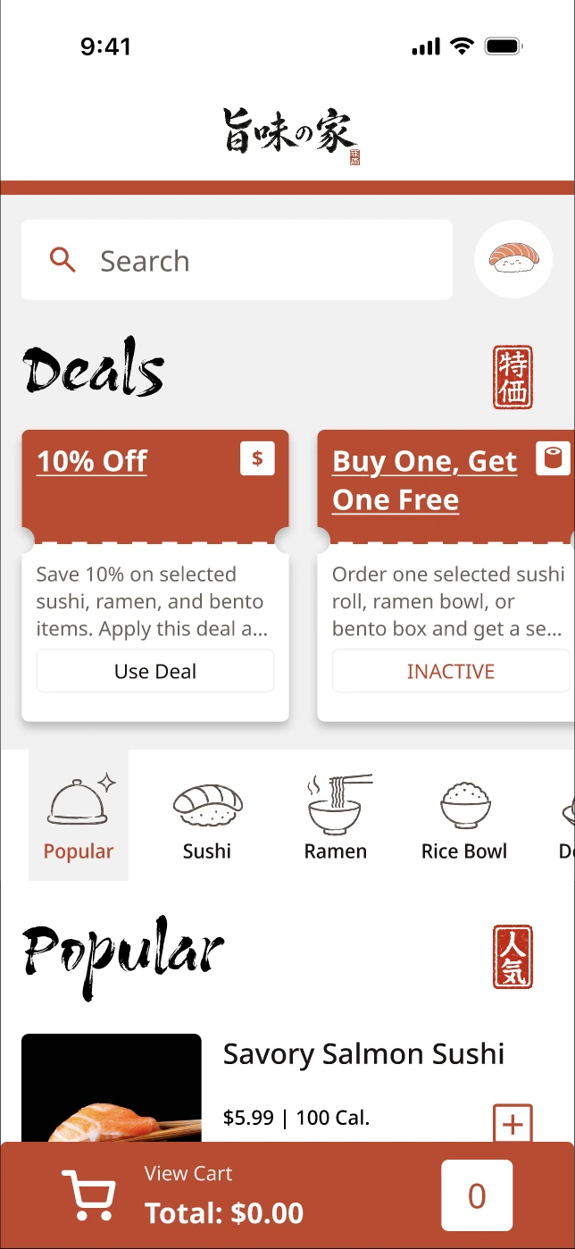
Stacked content, horizontally browsable categories and deals, a persistent bottom cart, and a progressive vertical ordering flow keep the task focused.
A wide persistent header, cart access in navigation, multi-column menus, and more simultaneous content use horizontal space instead of stretching the phone UI.
The same layout logic was explored at an intermediate scale so navigation and content density could adjust with the available space.
Connecting the complete journey
The final prototype connects discovery through delivery. Information and order state persist across browsing, item configuration, cart, checkout, confirmation, tracking, and the return to Home rather than treating each screen as an isolated mockup.
Final interactive prototype.
What this process taught me
This was my first time working through the full UX process from interviews to testing. The research group was narrow and the test was small, but watching someone try the prototype made the design much easier to question. It connected the early research, paper sketches, prototype, and revisions in a way that the certificate assignments alone could not.
I would interview people across a wider age range, test with more than one participant, and run another session after revising the design. I would also explore unavailable items, order delays, payment failures, and other moments where the ordering flow can break.